
Solution
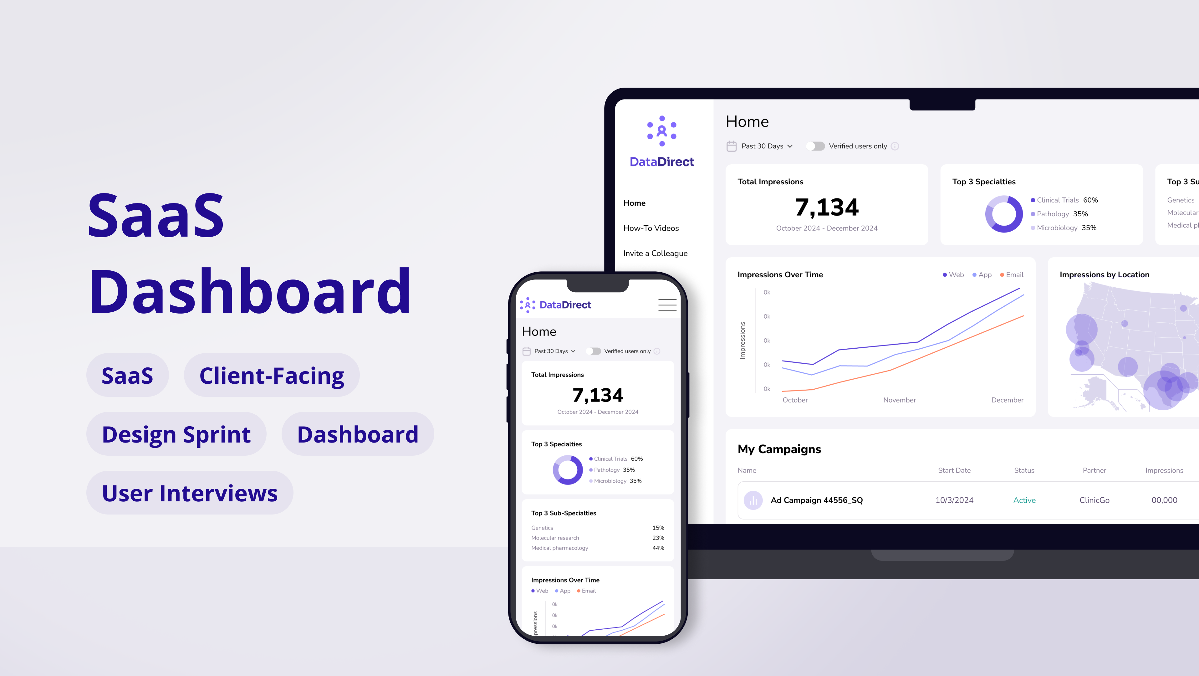
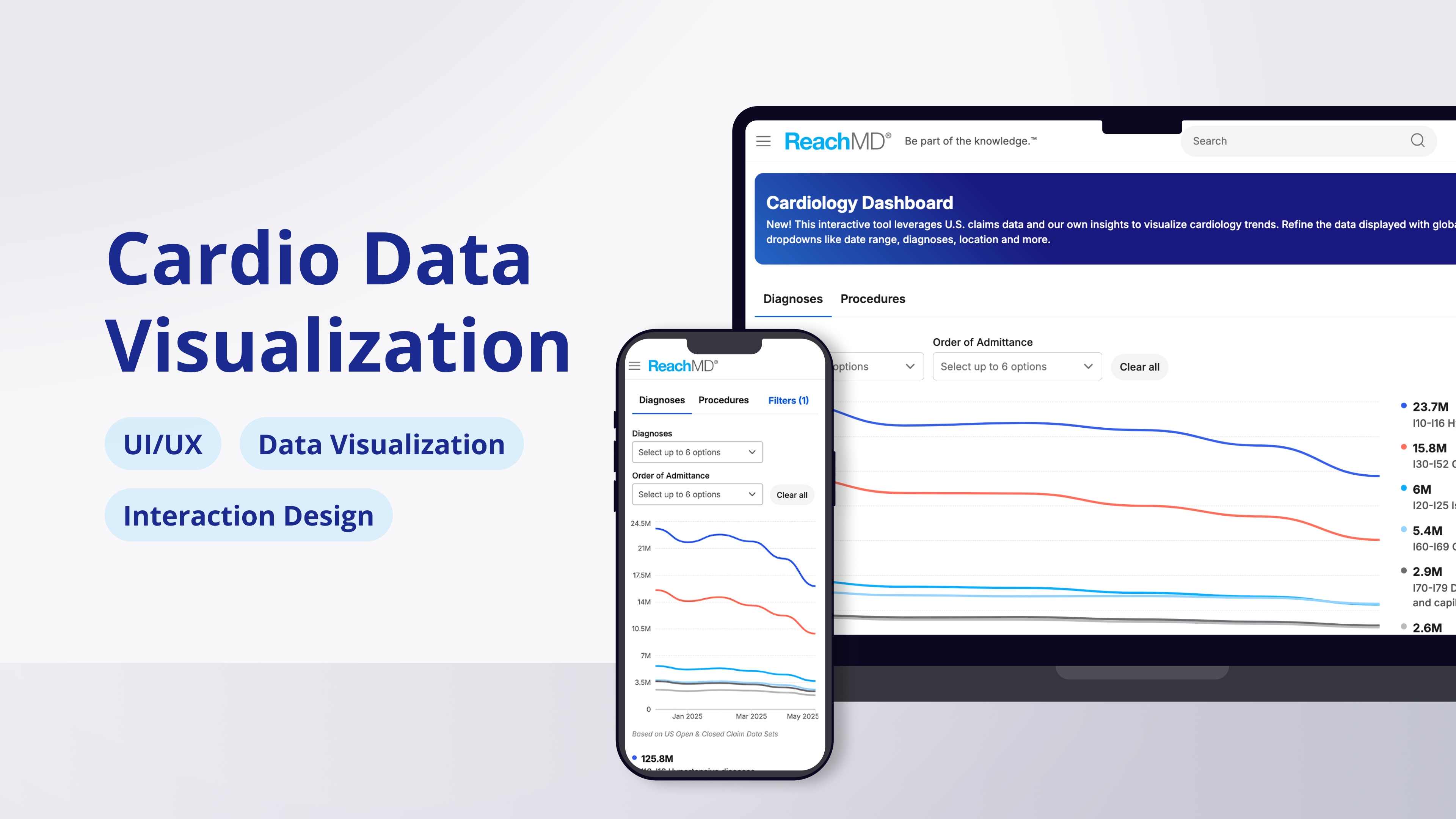
The feature proposed was called the Cardiology Dashboard, an interactive tool that would help healthcare professionals explore national cardiology trends. This tool would update monthly as new data became available. The hypothesis was that time spent on site would increase amongst the users (mainly cardiologists, a popular profession on ReachMD) who interact with this feature.
To support this solution, I was challenged to design an interface that turned complex information, multiple data sources, and a number of sub-categories into a clear, approachable resource that aligned with ReachMD’s professional brand. The final result needed to be responsive, easy to use, and kept users clicking to discover more.
Responsibilities
✔️ Layout, appearance, states, and behaviors
✔️ Figma designs, creation & application of design system components
✔️ Application of brand palette
✔️ Design hand off and user acceptance testing
Data Visualization UI/UX
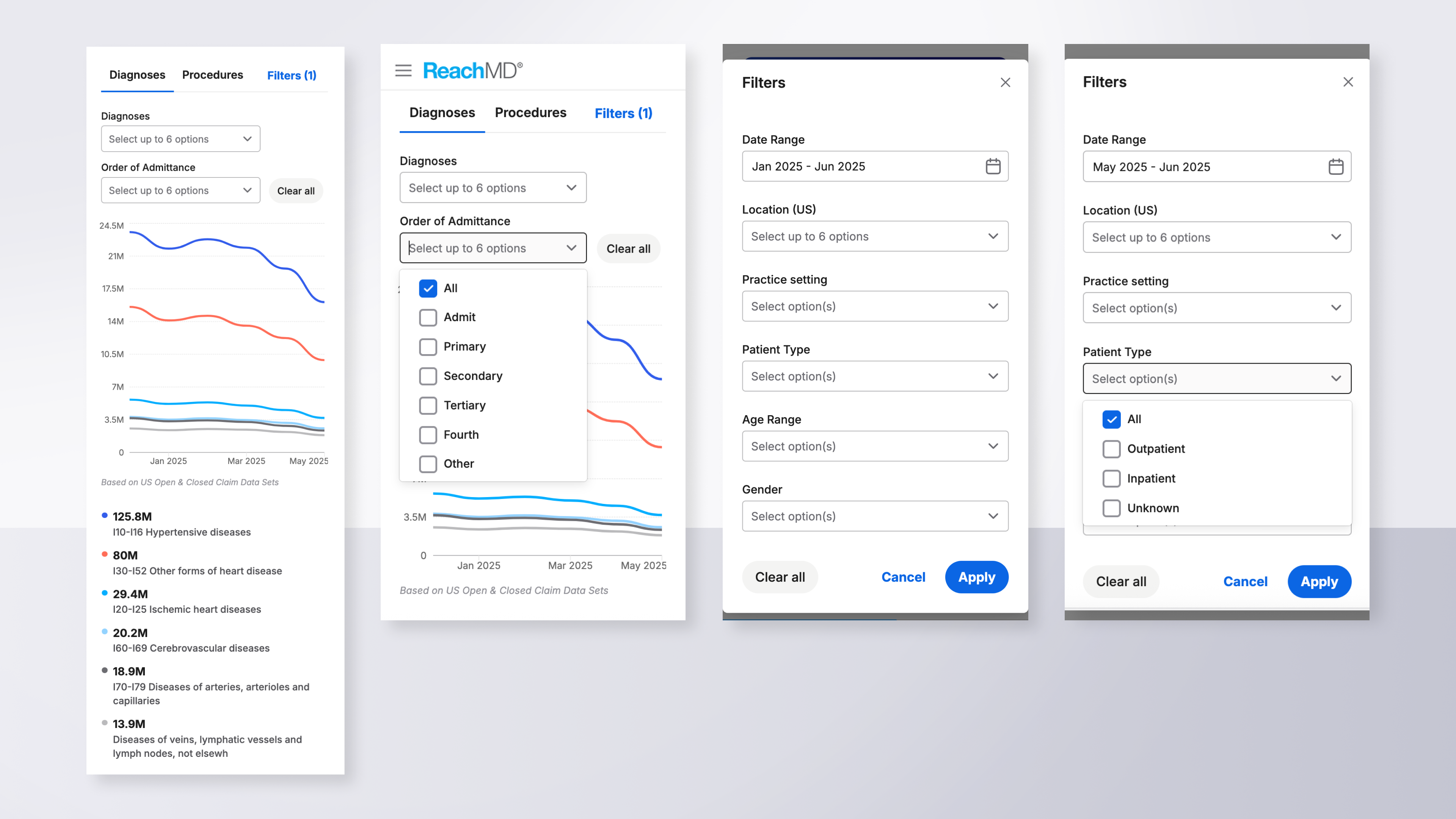
The first step was to design a modern data visualization in Figma, split into two graphs called Diagnoses and Procedures. These graphs, held in 2 tabs, would visualize the two main categories of data. Filters were then designed for each tab to support sub-categories and allow users to show / hide different aspects of each category.
Should interest in this feature catch on, the setup was also designed to hold a third tab called Providers, which would display several smaller charts and graphs. This multi-phase project meant an increase in department collaboration like design hand off phases, user acceptance testing, and regular meetings.
Interactive Features
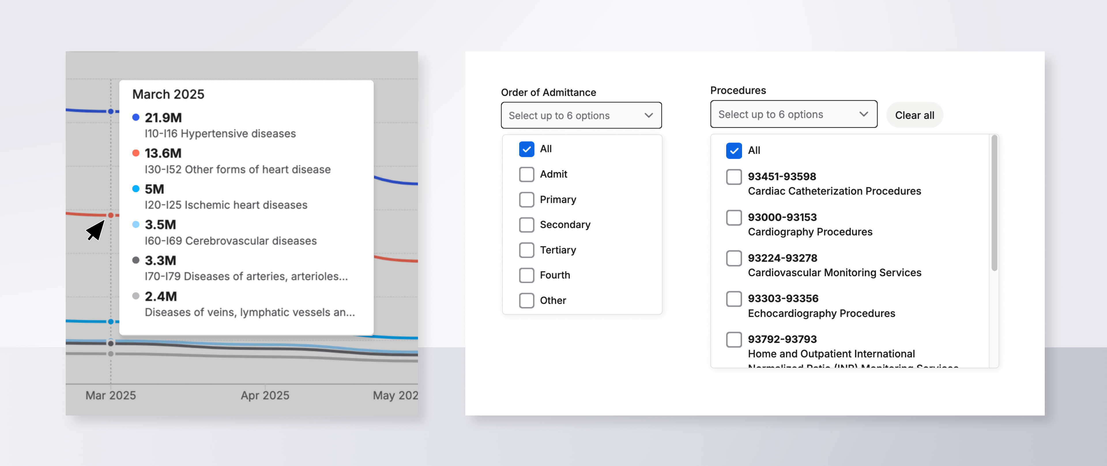
The charts alone show interesting cardiology trends. But to increase interactivity, I designed a chart legend (activated on hover) that appeared over the data to reveal monthly numbers. Next, to support categories outlined from the proposal, I created a system of multi-picker dropdowns.
Here you can see the monthly breakdown legend and the two dropdowns from the Procedures tab, which use a checkmark / picker system to allow for a large number of combined options:
VIDEO: The chart legend appears on hover and shows data for individual months. Motion tracking enables it to slide with the users movements.
Advanced Filtering
One core feature of this tool would be its advanced filters, a third level which further narrowed down both tabs of data by details like date range, location, and age range. To include this, I designed a pop-up experience (accessible by clicking the blue "Filters" link) that housed six filters whose UI varied based the information's format. Ex: A date picker was designed for dates, dropdowns were used for written options, and clickable filter chips were built out to support the multi-picker choices.
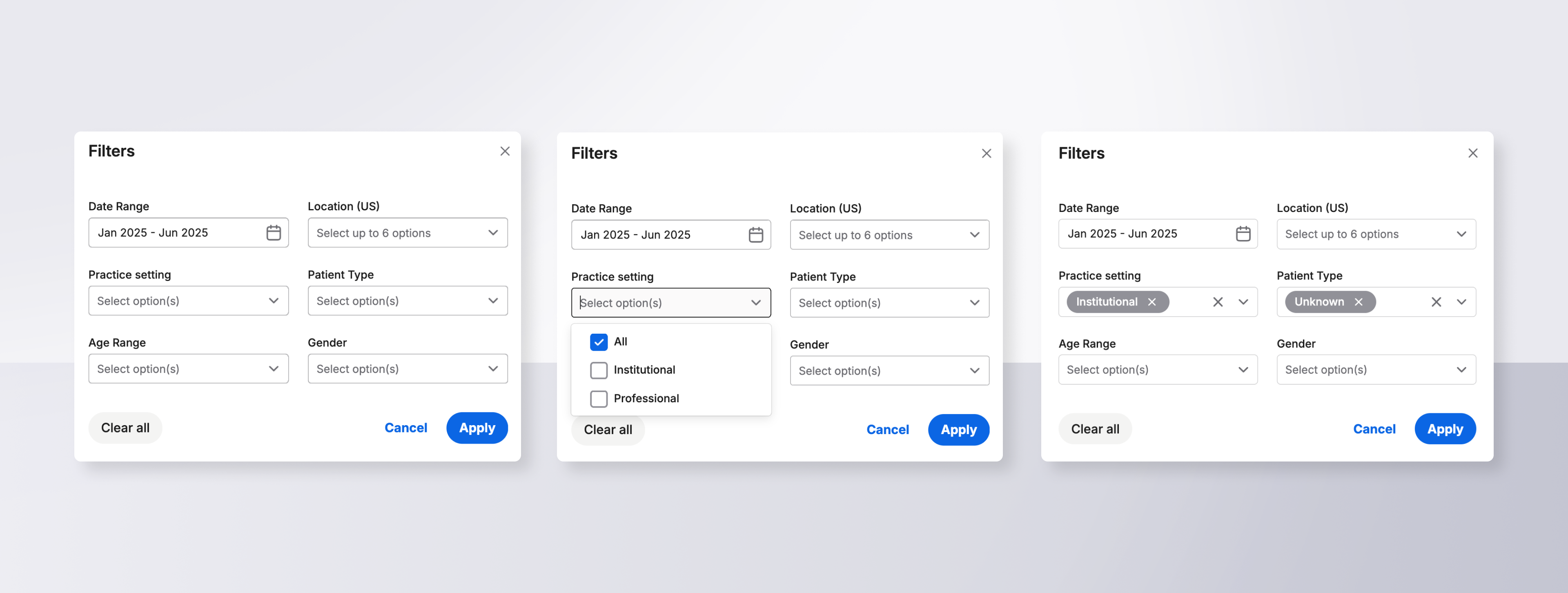
VIDEO: Advanced filters in a pop-up module allow users to explore a variety of visualizations.
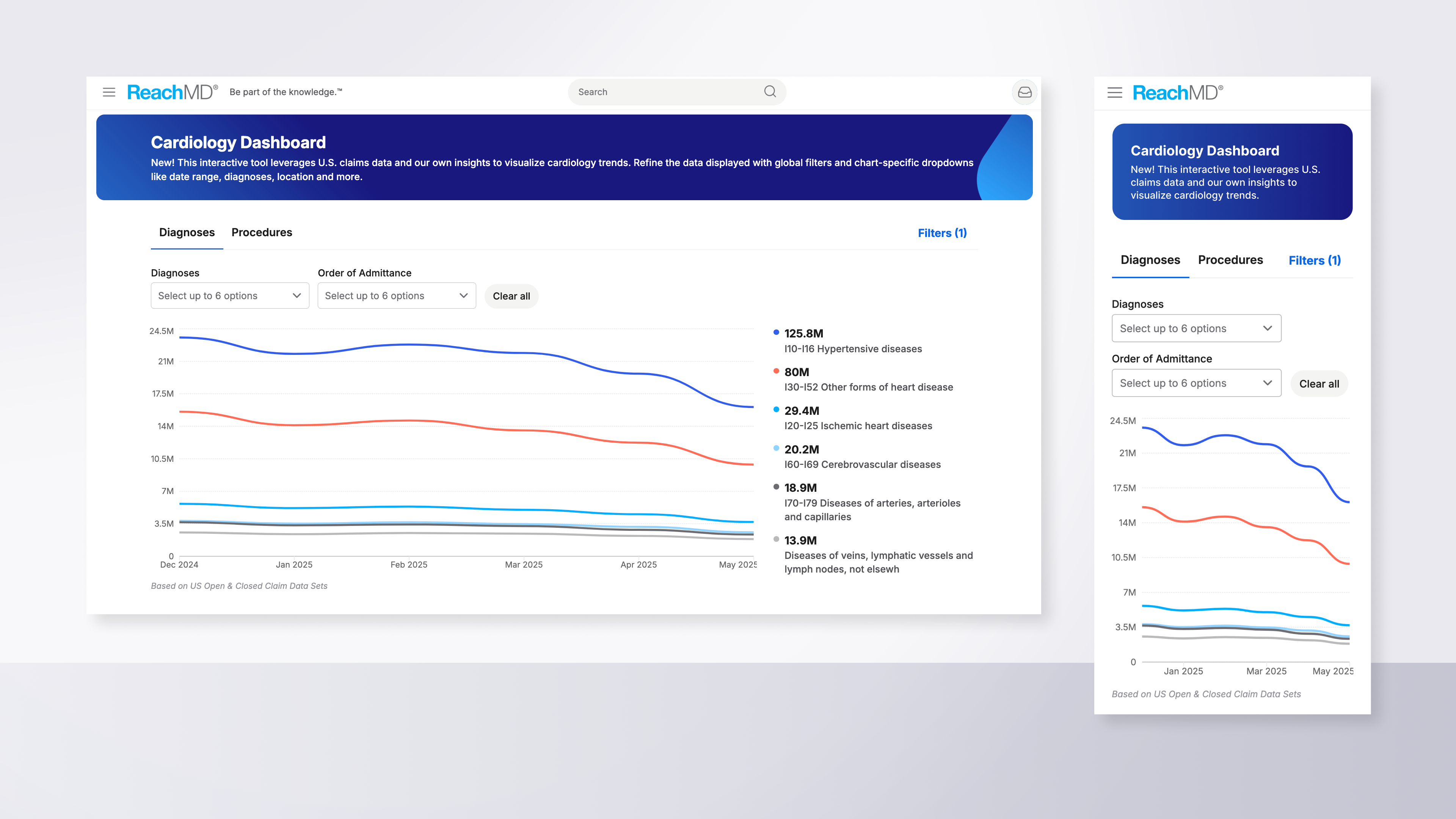
Mobile Layouts
As I worked on the desktop layouts, I also periodically rendered mobile designs using responsive features in Figma. This ensured each new feature had formatting rules that would keep it readable, clickable, and generally accessible at smaller sizes.
I also used Figma features like autolayout, the variant library, variant modes, plus prototype mode to ensure features switched, moved, or reduced in size correctly before handoff.
Results
The first phases of the Cardiology Dashboard launched early in 2025 and performed well as a new feature in ReachMD’s suite of healthcare education tools. Several months later, the page performance was promising enough that my designs for the Procedures tab were built and published.
Today, performance remains strong and cardiologists have increased their time on site, a win that can be expanded to many other professions.
If interest remains sustained, additional features like the third tab will be added over time, using the existing design system and interface style as a base.