
Solution
I was challenged with generating a style and interface that was efficient, cohesive, and met the fast deadlines needed to rollout the first phase of the product.
Through weekly meetings with stakeholders and the AI development team, I began devising a strategy and ultimately created a scalable system of colors and interface elements in Figma that could be applied to the product, now named Clara.
Responsibilities
✔️ Layout, appearance, states, and behaviors
✔️ Figma designs, creation & application of design system components
✔️ Application & expansion of brand palette
✔️ Modification and application of logo
✔️ Design hand off and user acceptance testing for an AI tool
✔️ Email design and handoff with Figma
✔️ Weekly stakeholder and dev team meetings
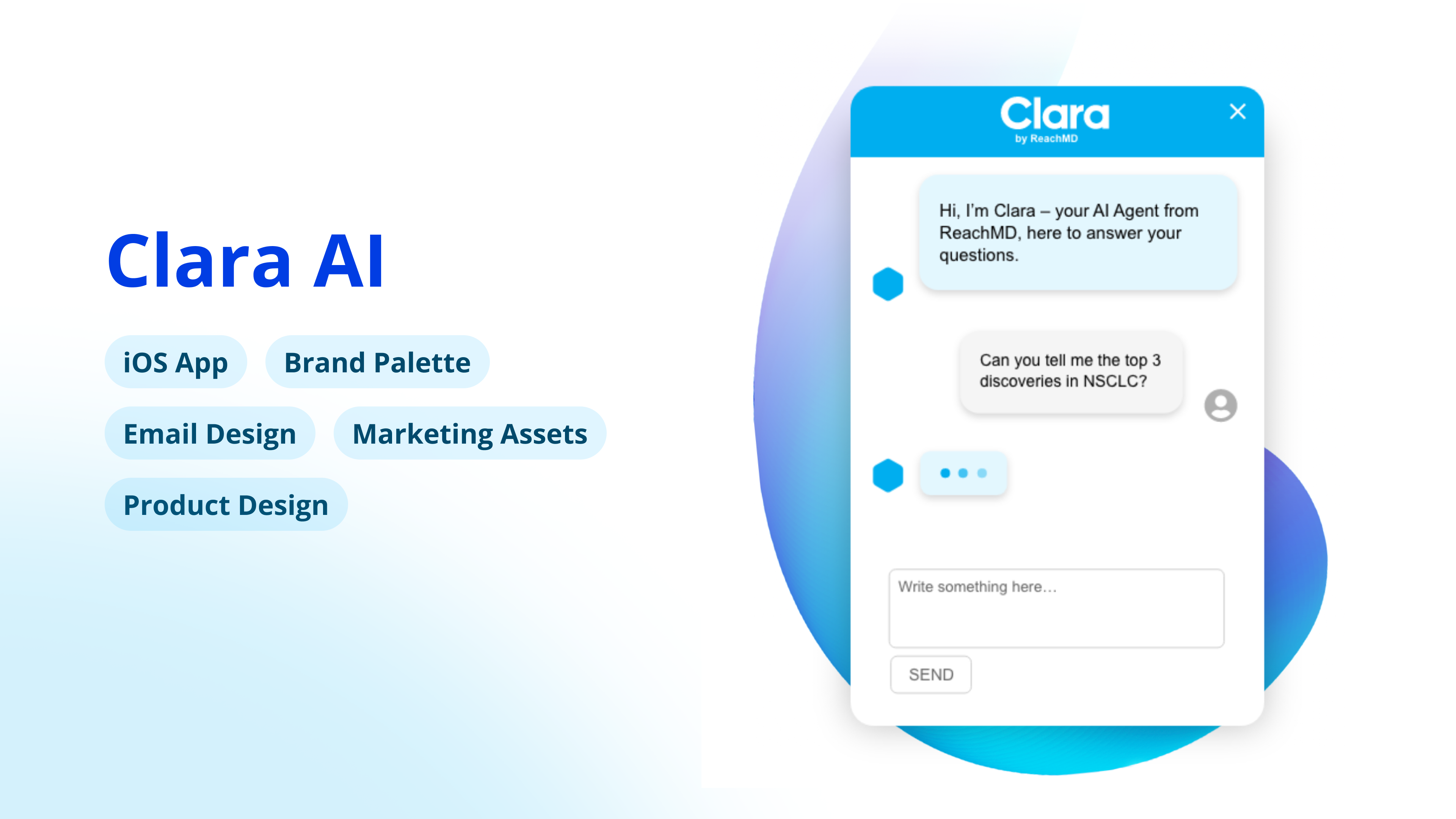
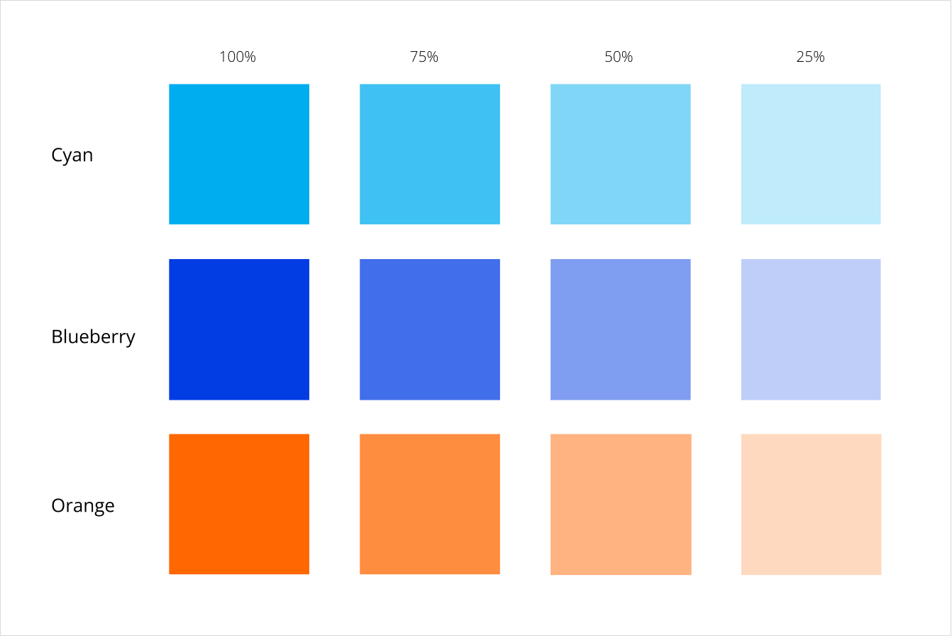
Brand Palette
I built on ReachMD's existing color palette to generate an array of vivid RGB colors in a spectrum of attractive shades.
Clara 1.0
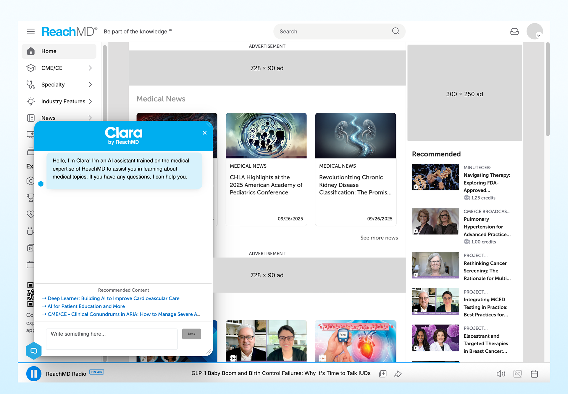
The first version of Clara was a chatbot on the homepage of ReachMD. I created designs quickly and worked with a product owner to transfer to the AI team.
Although this product had a fast launch date, the most challenging aspect was incorporating her on the ReachMD website in a way that reflected the clean, fresh style of the brand. The website featured many dynamic elements that I had to balance with the chatbot to produce a positive user experience.
Results of 1.0
Performance was promising, but Clara's competition with the established ReachMD experience was being reflected in the data. For cleaner data and more insight into the newly launched experience, it was decided to isolate Clara on an iOS app.
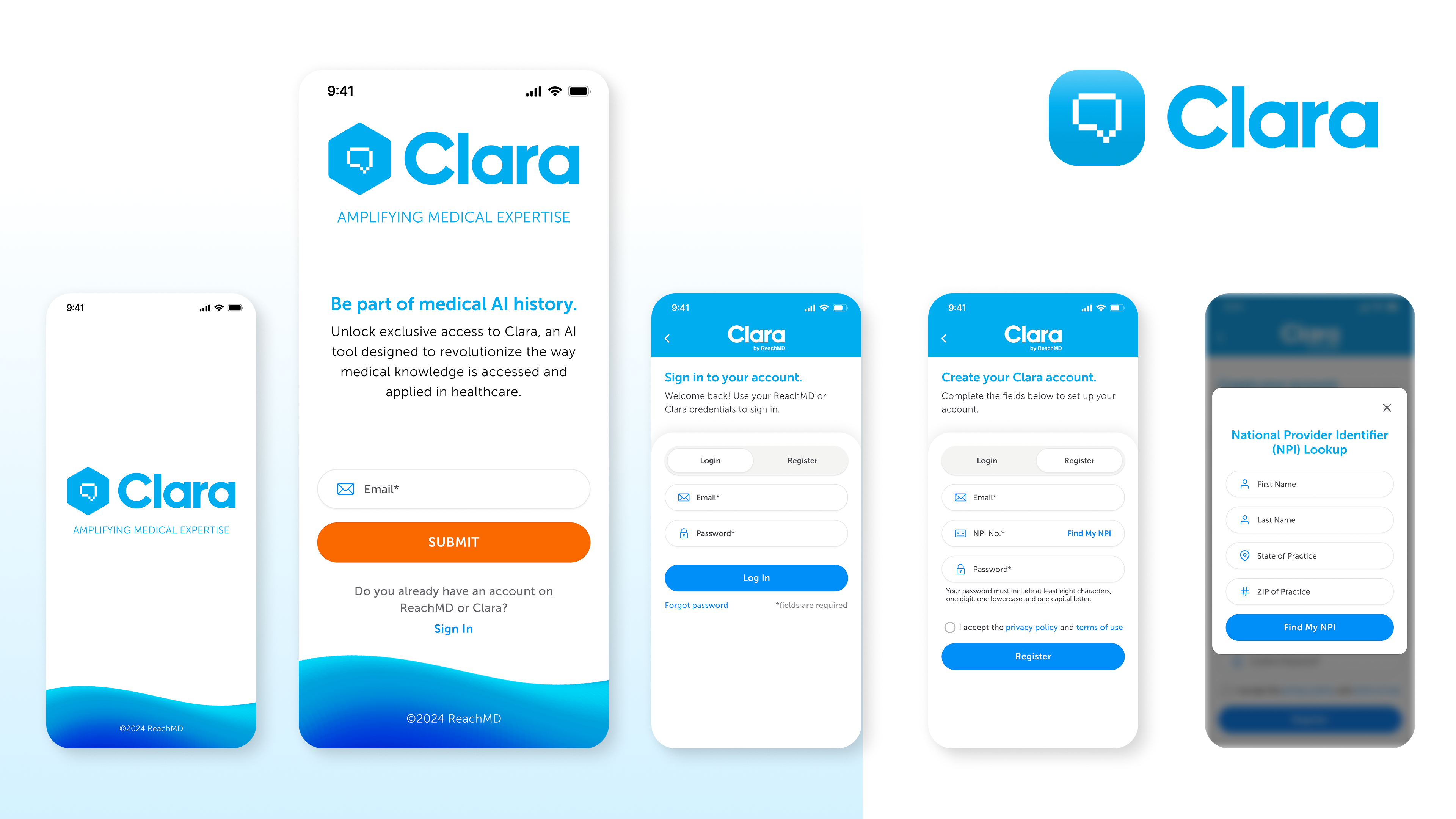
Clara 2.0 (iOS App)
While your average app can seem intuitive, Apple iOS apps have detailed requirements that include UI/UX. To follow build requirements for iOS, designers and developers must follow an iOS-specific design system called the HIG (Human Interface Guidelines).
Using these guidelines and Figma files that Apple provides to developers, I designed features like cards, menus, and buttons that translated Clara from her current UI to one that followed HIG. This included screens like login/register, authentication, error messages, loading elements, form fields and updated chat flows.
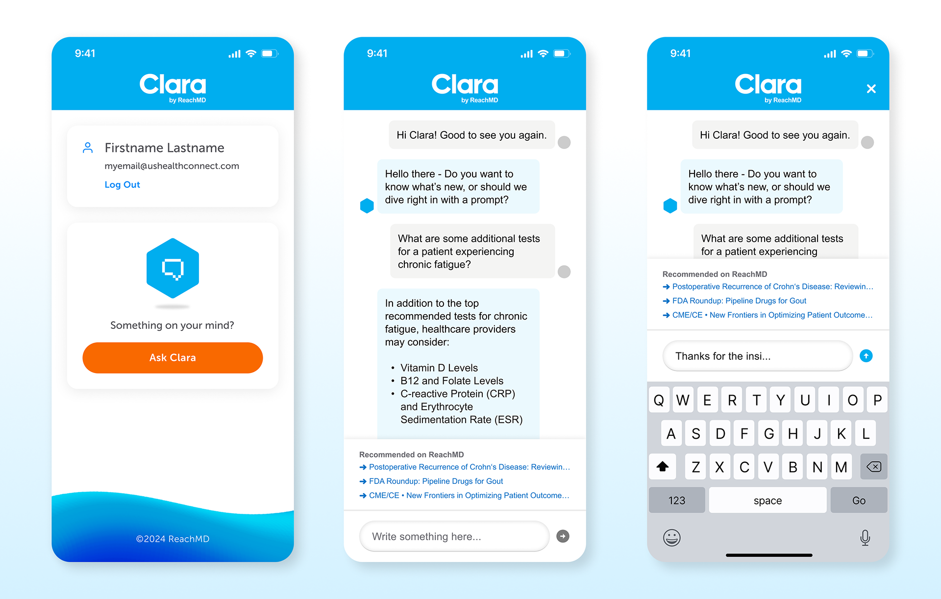
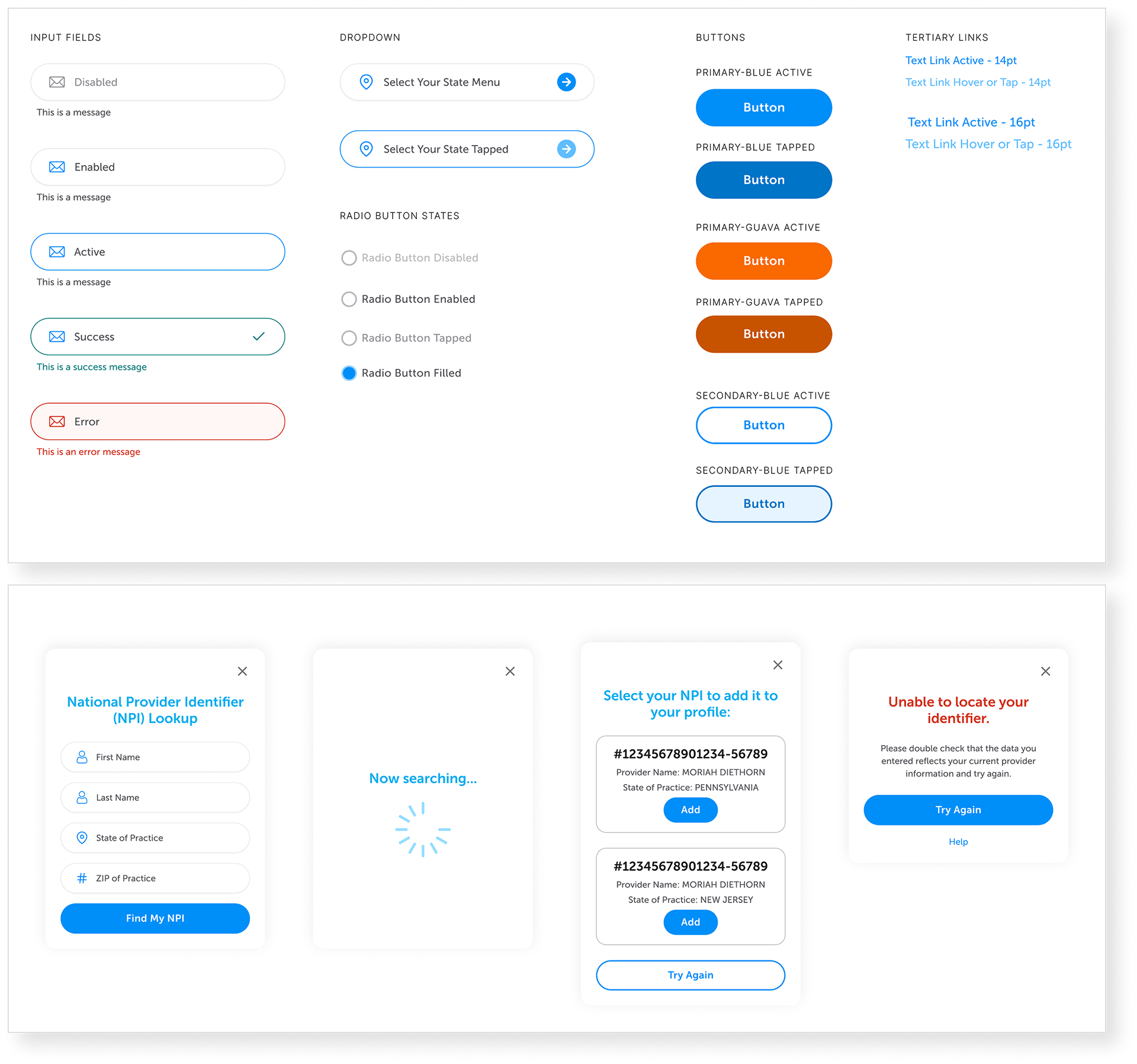
Like the first version, I collaborated in development handoff, user acceptance testing, weekly stakeholder meetings, and periodic app updates to keep the experience usable and engaging.
Email Design, Marketing Assets
To encourage use, potential users were reached via emails. For this leg of the project I created logo lockups, produced key visuals, and designed developer-ready emails with Figma. I also corresponded with the email team to ensure the final HTML templates passed design review. Designs purposely showcased the relation to ReachMD in order to affiliate Clara with a trusted brand.
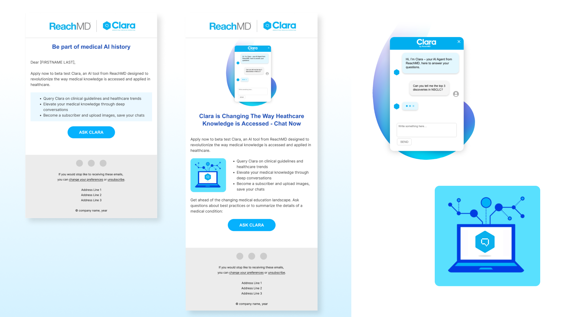
I applied Clara's brand style and guidelines to an interactive chat interface.
Results
Clara 2.0 provided enhanced engagement and successfully drew an increased number of medical professionals to the product. Together with the website chatbot, hundreds of verified medical professionals interact with Clara each month. It has become a core feature on ReachMD’s platform, valued for both its utility and engaging design.
Because of successful performance, the chat interface now supports ReachMD by suggesting content within conversations, creating new opportunities for personalization and monetization.