
Solution
To address this, the company decided to use Design Sprint methodology to quickly test whether a dashboard could truly elevate their advertising packages.
I was sourced by the main sprint facilitator to assist the team from stakeholder interviews through ideation, prototyping, and testing within one week. As the interface designer, I was challenged with both facilitating the ideation and then creating high-fidelity prototypes based on the sprint decisions.
Once the platform moved into development, I also contributed to UAT for the live site and created how-to guides to onboard first-time users.
Responsibilities
✔️ Assisted with facilitation of the Design Sprint
✔️ Synthesized low-fi prototypes into full platform designs
✔️ Configured multiple Figma prototype flows
✔️ Conducted client testing and feedback sessions
✔️ Performed UAT on live platform
✔️ Wrote and constructed walkthroughs with Scribe
What is a Design Sprint?
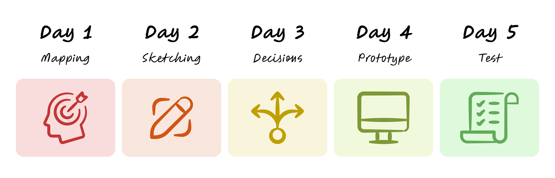
A Design Sprint is a five-day process developed by Jake Knapp and John Zeratsky at Google Ventures. It helps teams rapidly move from problem to tested solution through five key phases:
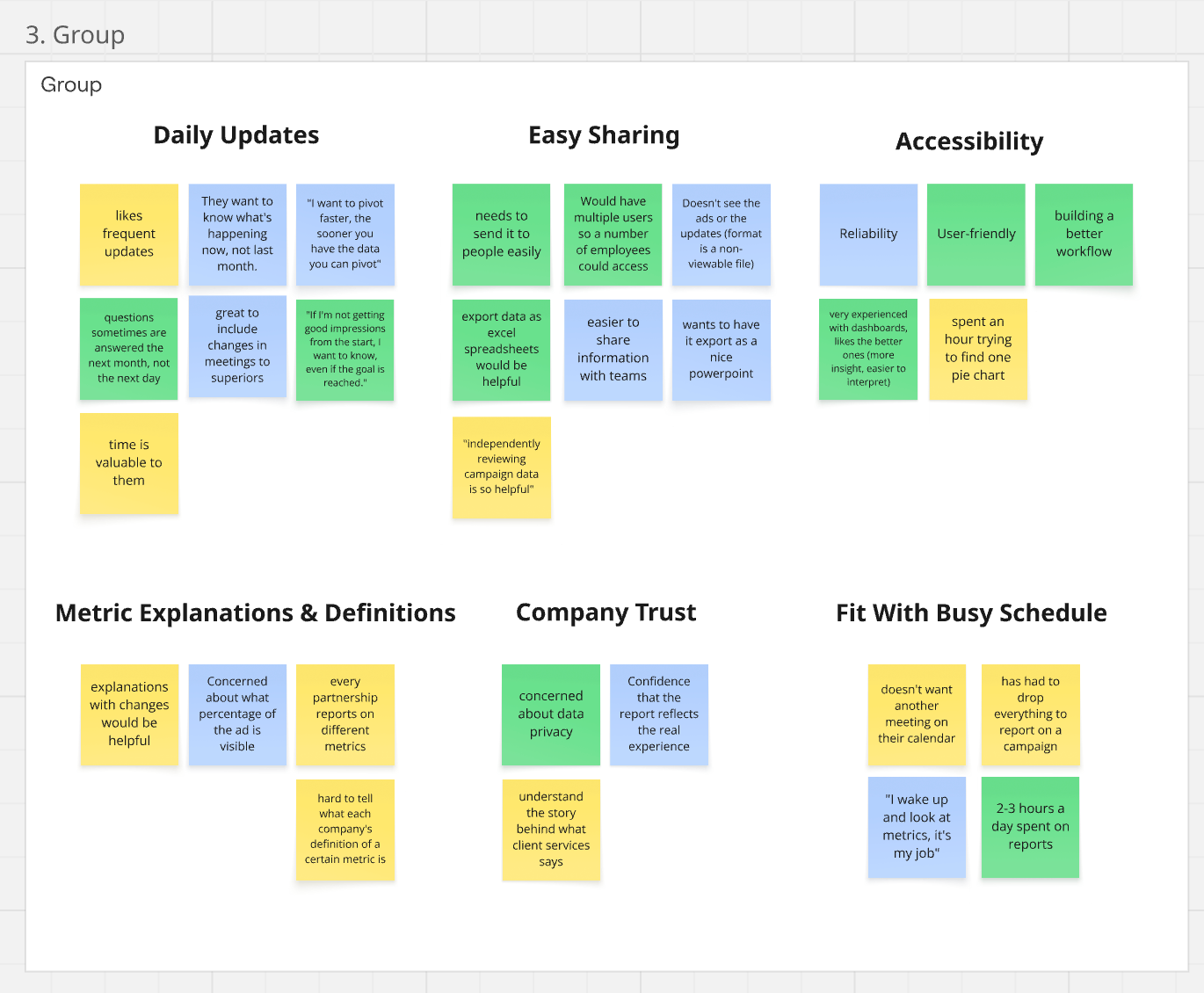
Prep Work: Affinity Diagram
Before the sprint began, our team conducted client interviews to understand their needs. Insights from these interviews were organized using an Affinity Diagram - a method for grouping related ideas and observations to reveal patterns and prioritize features.
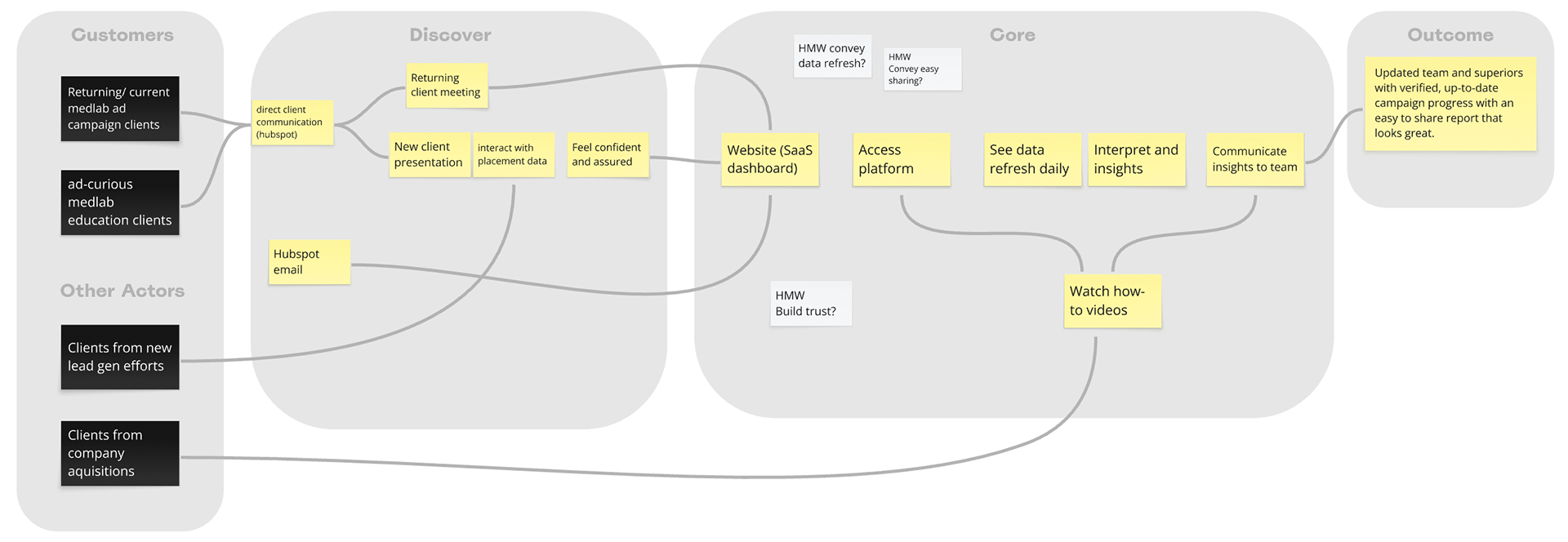
Day 1: Mapping
On the first day of the sprint, our team defined the problem space and mapped out the key user journey. We used the collaboration platform Miro to document and identify goals, challenges, and critical touchpoints to guide the sprint.
Day 2: Sketching
Using the mapping decisions from yesterday, team members sketched potential solutions individually. This encouraged diverse ideas and allowed the best concepts to emerge without group bias.
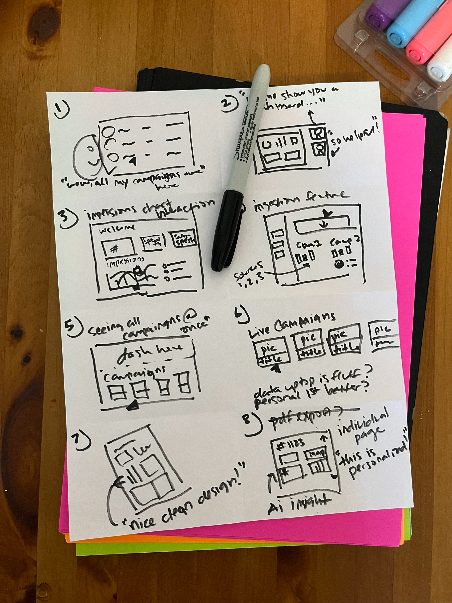
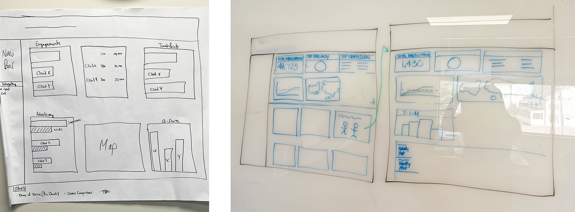
Day 3: Decisions
The team reviewed all solution sketches and selected the most promising ideas. Final decisions were visualized by creating low-fidelity sketches with labels and some placement data, allowing the team to see how concepts would work in practice before moving into prototyping.
Day 4: Prototype
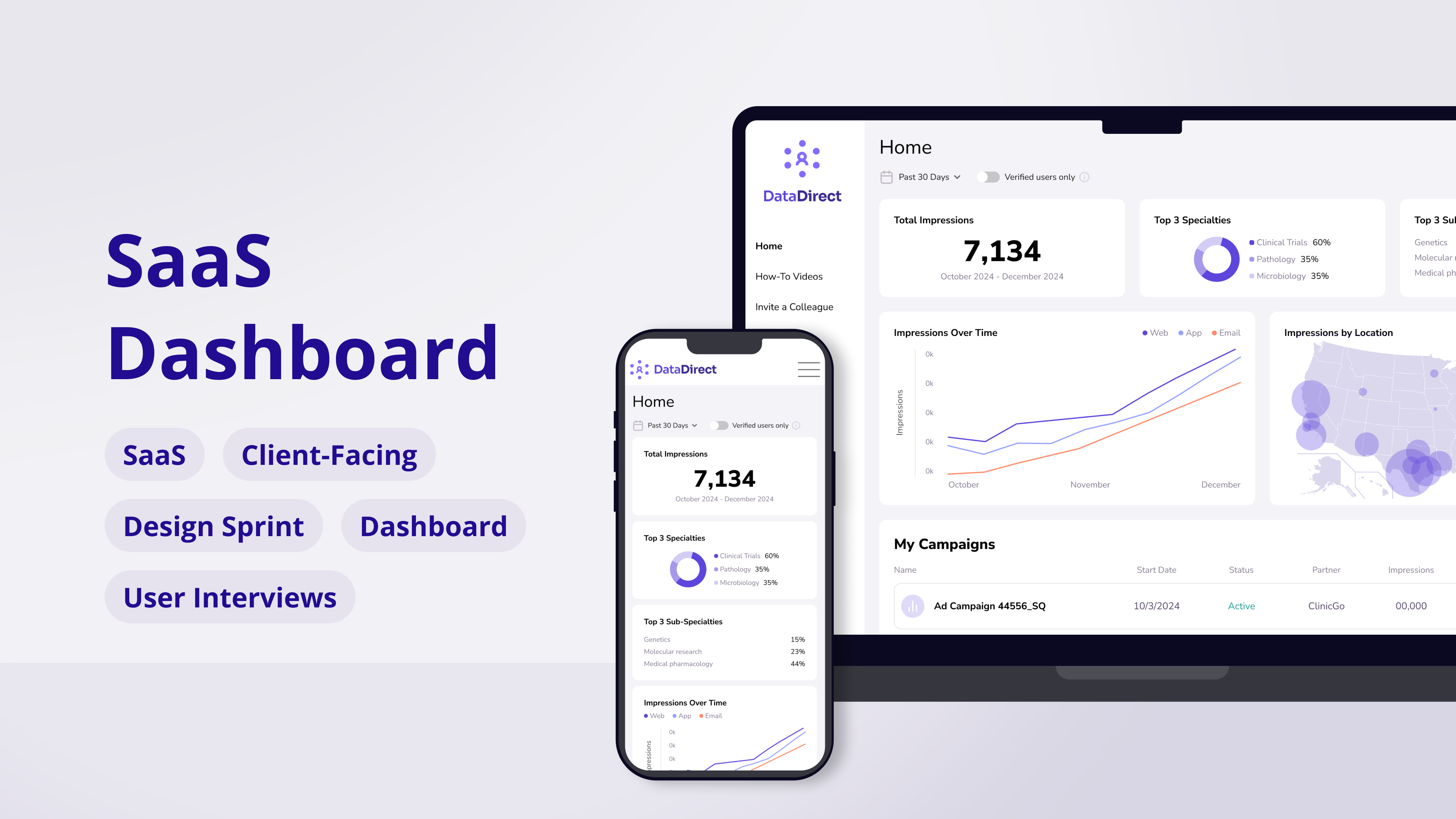
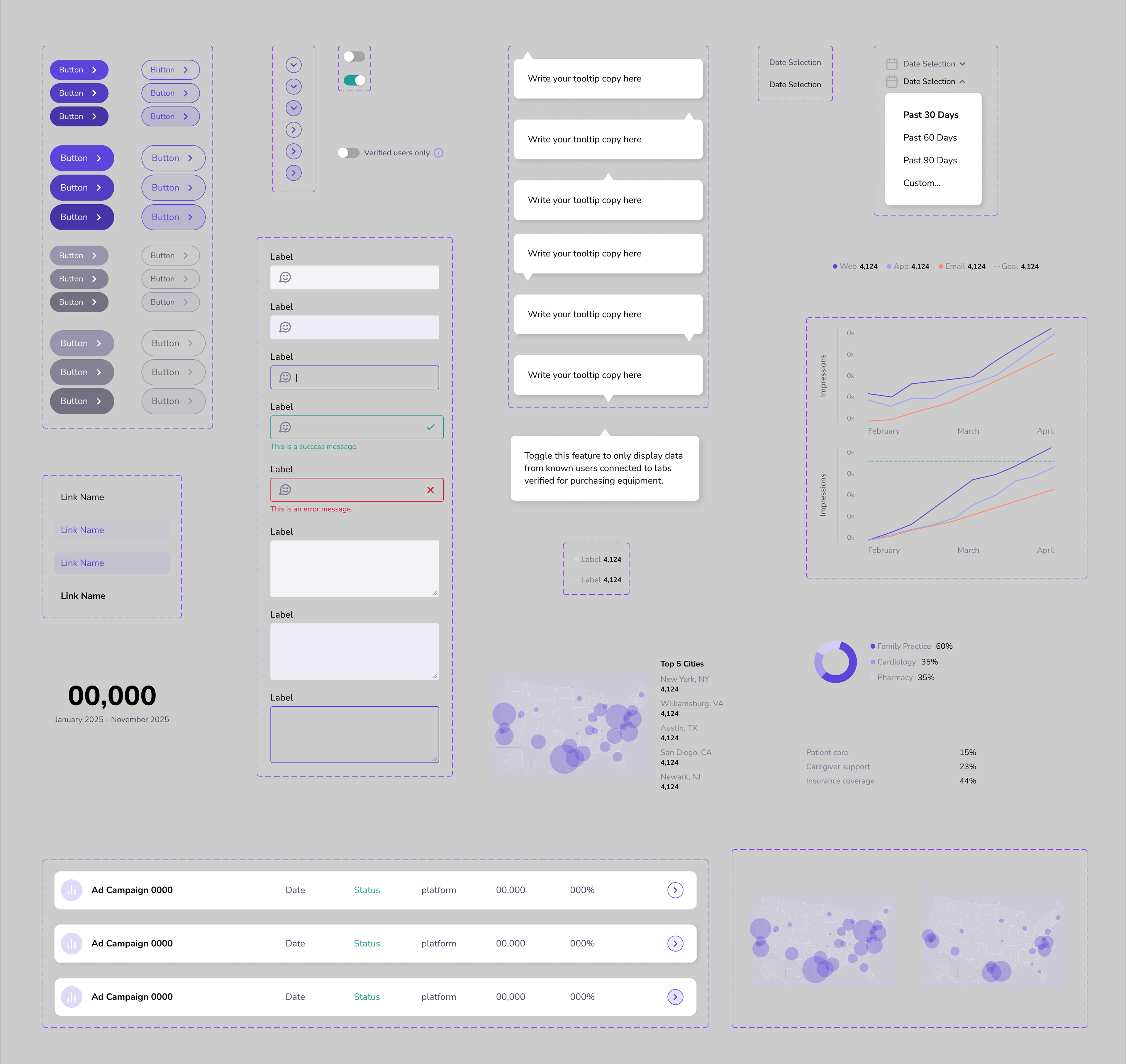
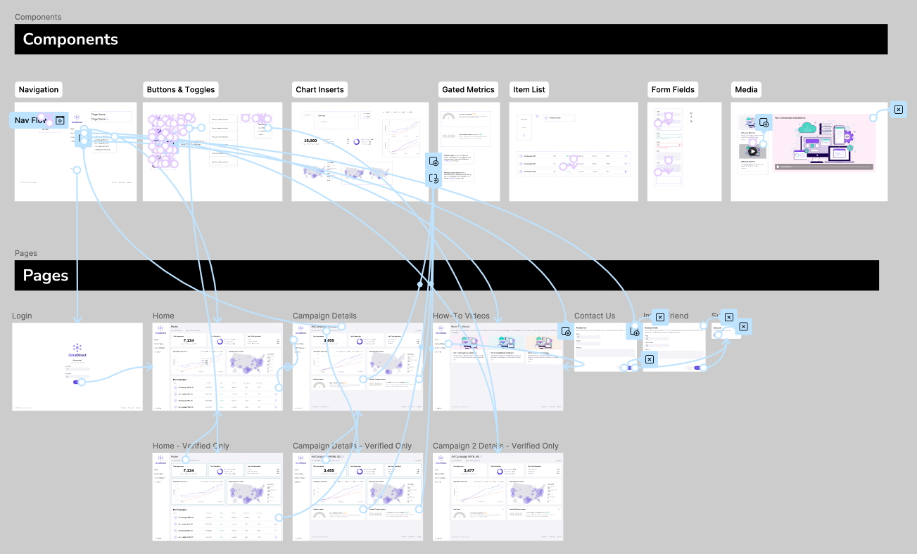
For this step, I built a high-fidelity prototype of the dashboard in Figma, designing all key pages and interactions in detail. By the end of the day, the prototype was fully functional and realistic enough to be tested with clients, showing how the solution would work in practice.
First, DataDirect users sign in to see a dashboard as their homepage, pre-populated with their campaigns.
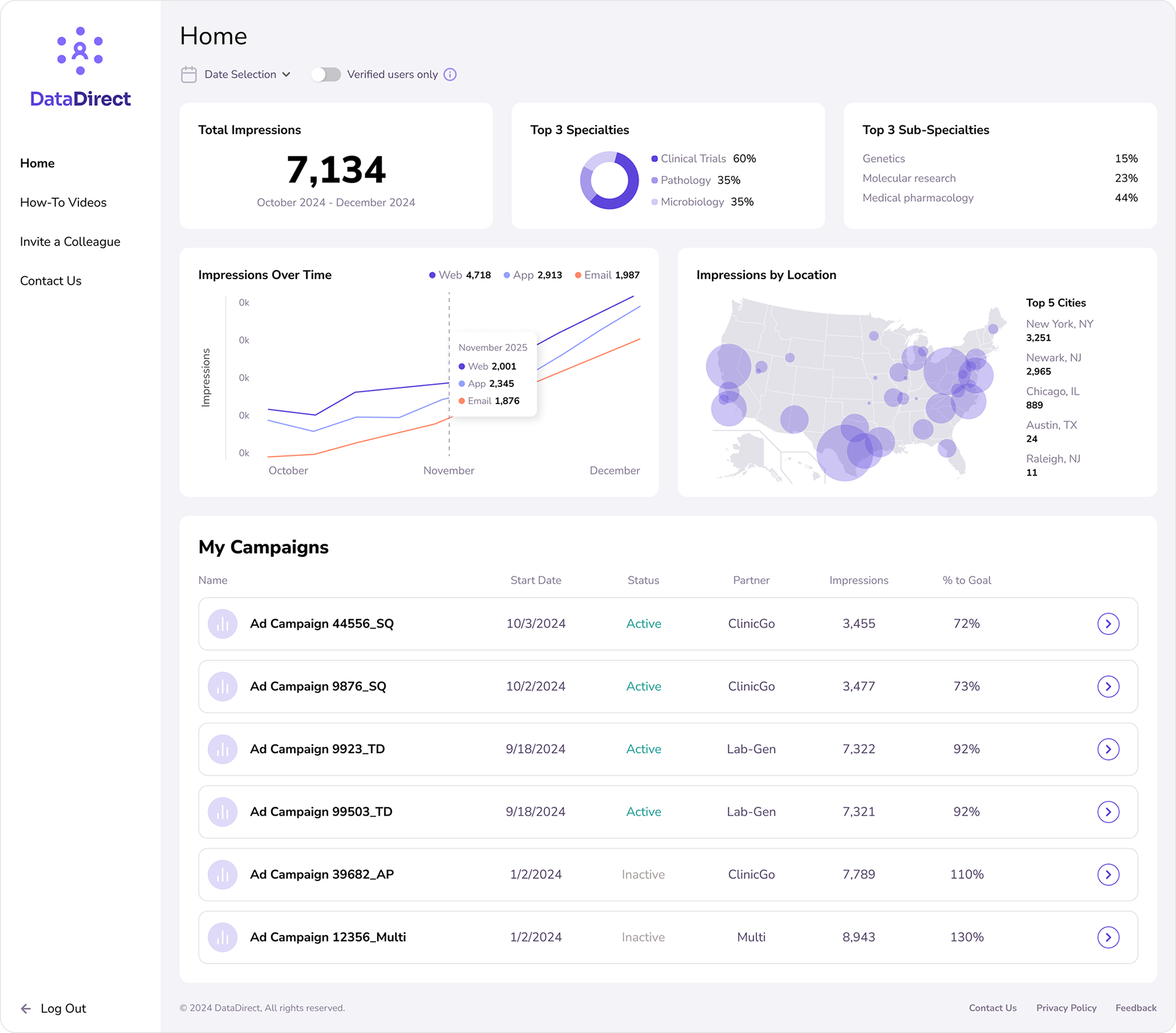
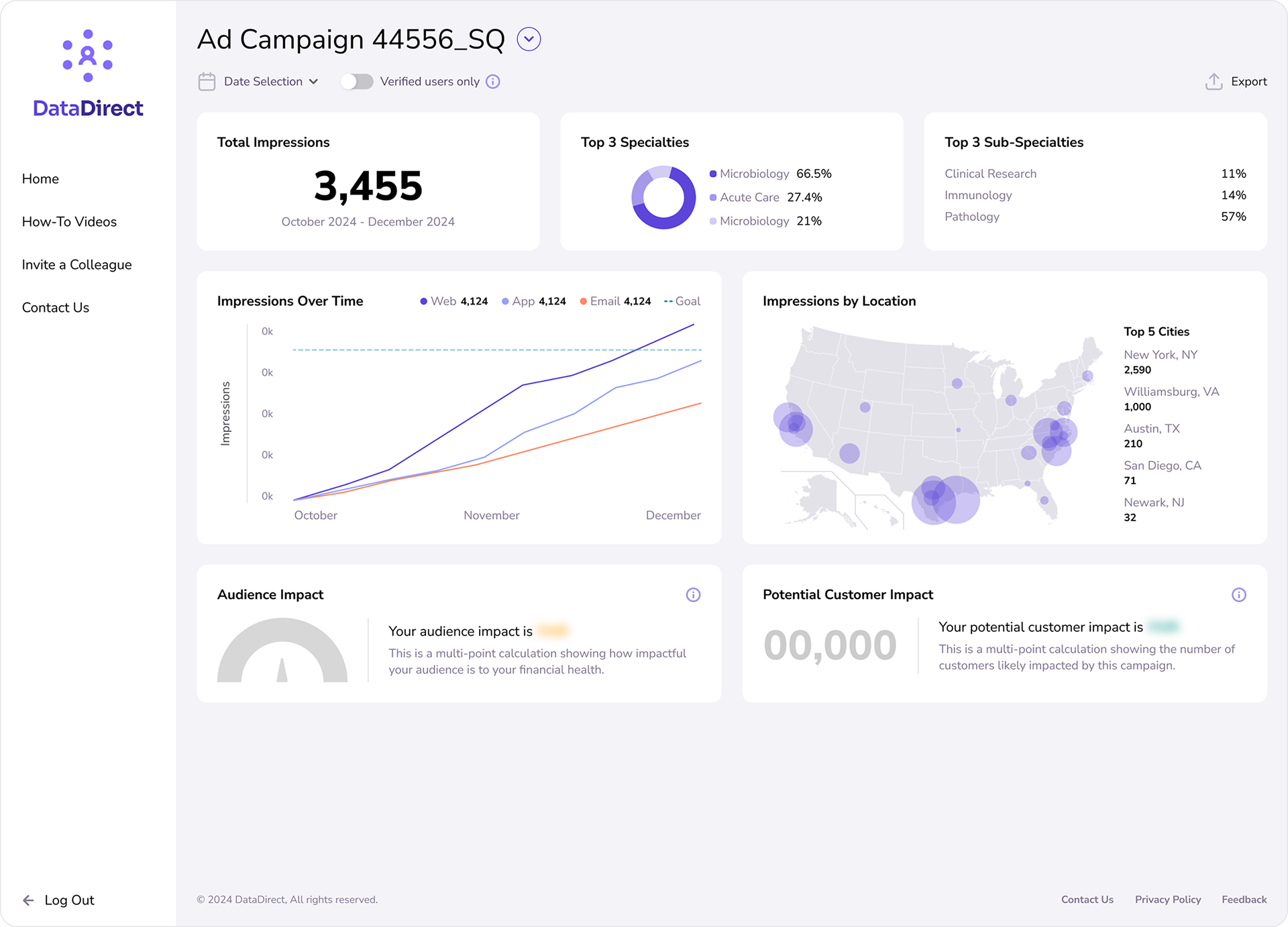
Clicking a single list item under the "My Campaigns" section navigates users to a similar dashboard, displaying metrics for the campaign of their choice.
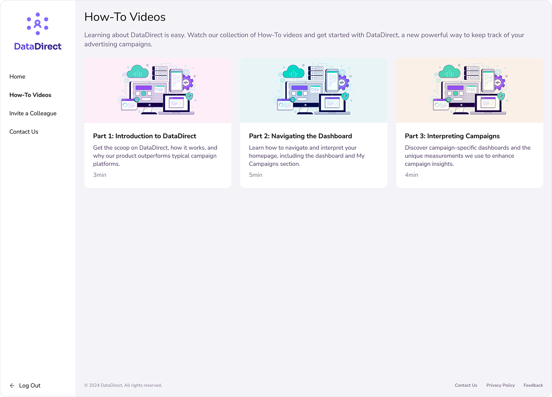
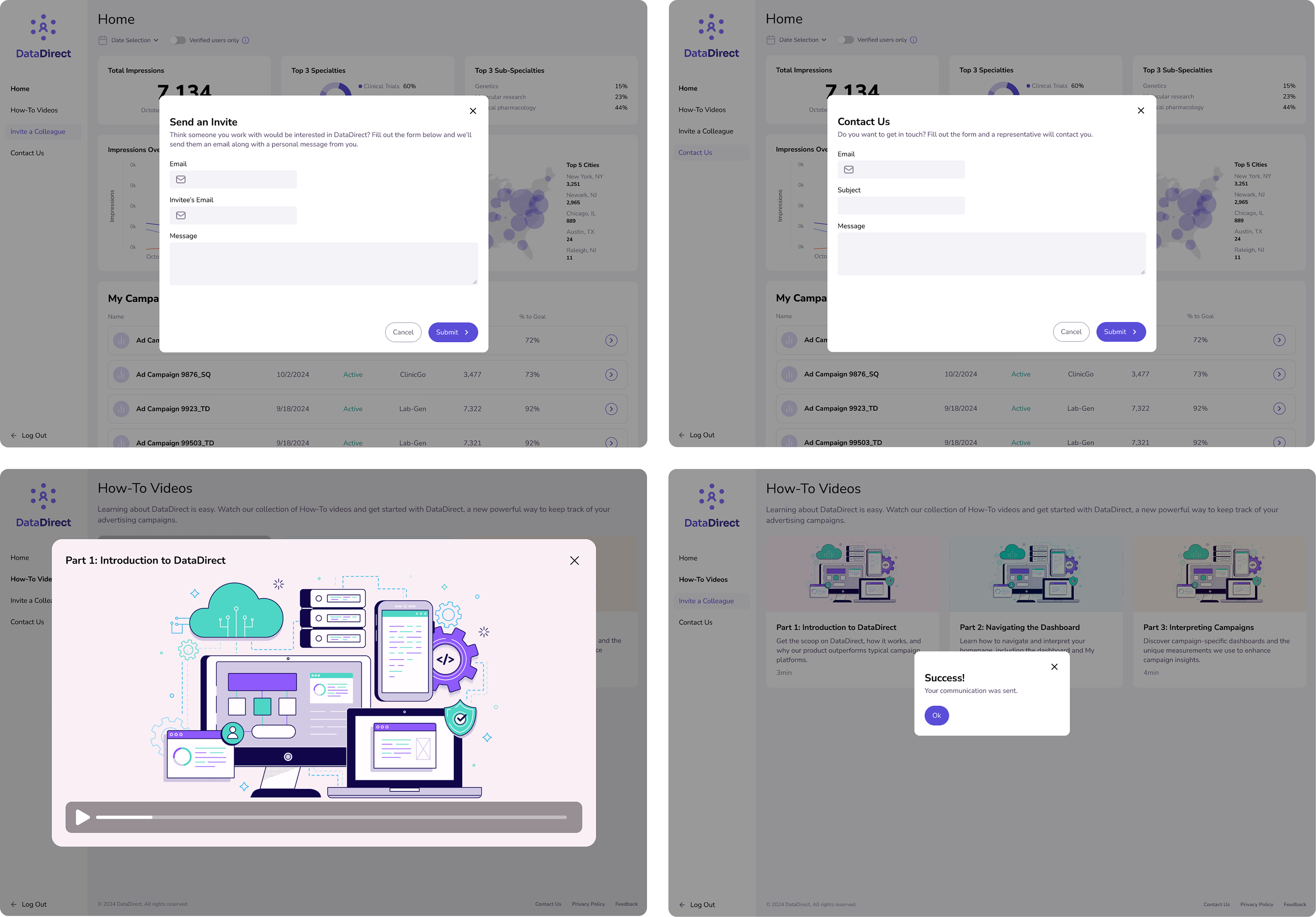
A series of how-to videos (created using Scribe) are accessible from the main menu (left)
I also designed a number of pop-up modules to support contact capabilities, multimedia, and form validation feedback.
The key to this prototype was the design system I made in Figma, which helped me utilize components instead of single-use assets. This kept the style consistent, allowed for quick formatting changes across all instances, and embedded pages with rules for responsive resizing.
Lastly, using Figma's prototype mode, I created interactions by connecting elements (blue arrows) and creating state changes for interactive components (purple). Each connection is a command to overlay, navigate to, or introduce another element.
Day 5: Test
The result of yesterday's work was a convincing, interactive prototype with multiple states, pages, flows, and modes. I used animation settings like dissolve and smart animate to give it the feel of a developed platform.
The prototype, now tentatively branded as DataDirect, was ready to be tested with clients. Observations from these sessions would validate assumptions, revealed pain points, and informed next steps for development.
The interactions and states in the prototype are captured on this screen recording, which shows how dynamic the prototype had to be in order to fulfill the business flows.
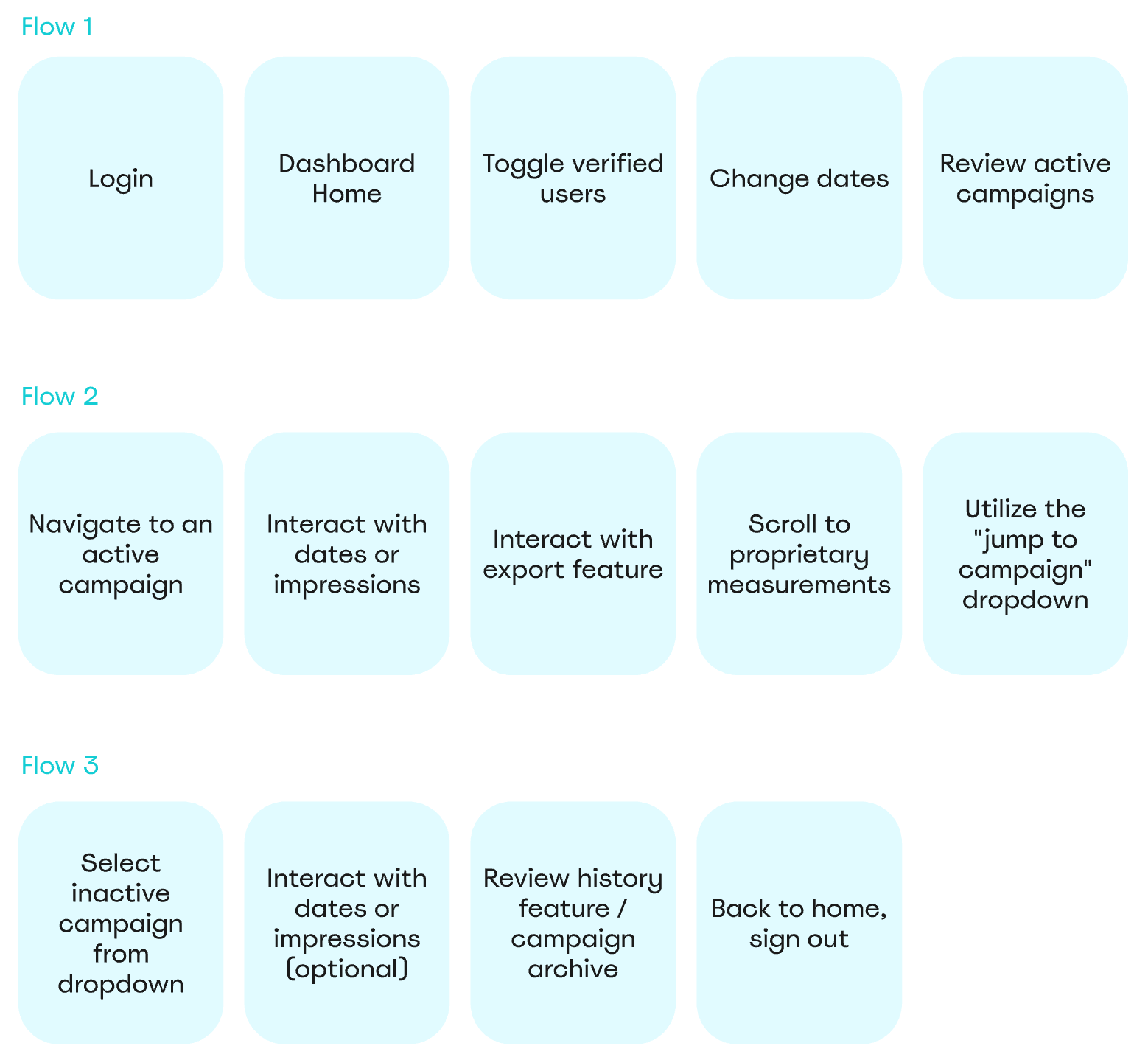
We took each test user through 3 flows, which were identified on Day 3 of the sprint as the most crucial for measuring product fit.
Scoring & Results
To score the product fit of DataDirect, the design sprint included a scorecard that was filled out for each customer. As each customer navigated through the prototype, the team and I gauged their response to important benchmarks, determined on Day 1 of the sprint. Each green or pink square represents a team member's opinion.
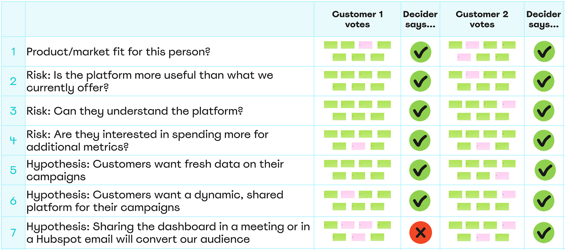
Testing confirmed that DataDirect directly addressed client pain points, and users were able to successfully navigate the prototype and complete key flows without assistance.
With this validation, leadership approved development, and the first phase of the dashboard is now live and in use with clients, turning a one-week sprint into a long-term win!
While still in it's early phases, DataDirect has become both a practical tool and a growth driver for the business.